English
 Deutsch
 Italiano
 Français
 Português
 ไทย
ไทย
 Tiếng Việt
 Polski
 Türkçe
 Nederlands
 Română
 한국어
한국어
 Svenska
 Español
I usually don’t write “how a feature works” pieces. Fifteen years in, I care about what an indicator does to my P&L, not how pretty its options panel looks. But Big Trades is different. It’s the kind of tool that’s easy to misread if you don’t understand what’s happening under the hood, and misreading order flow tools is exactly how traders end up fading real institutional size or, worse, front-running noise that was never there in the first place.

Test your hypotheses on real CME data.
I’ve been going through the implementation in Forex Tester Online specifically, not order flow tools in general, because the details of how an order flow indicator is built change what you can actually trust it to tell you. Before any of that — setups, rules, hard numbers — I want to walk through what Big Trades is actually doing when it prints a bubble on your chart, and share a few things I’ve already noticed trading it on NQ. Consider this the foundation piece.
What It’s Actually Reading
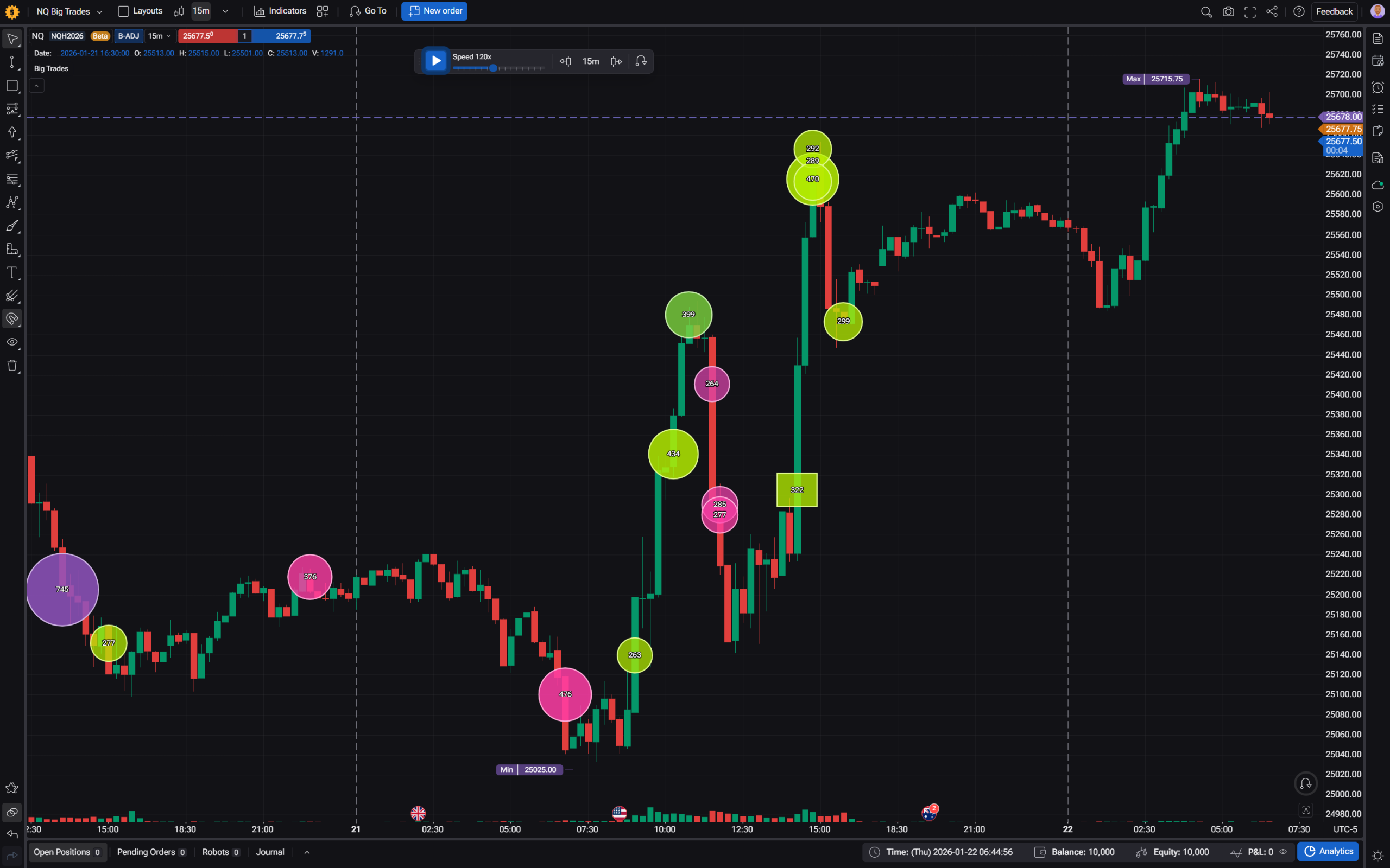
Big Trades works off tick data, not candles. On CME futures, NQ included, it has access to the real thing: last traded price, total volume, and, critically, separate ask-side and bid-side volume. That last part matters more than it sounds like it should, because it’s what lets the indicator determine which side was the aggressor on a given trade, rather than guessing.
That’s worth sitting with for a second. A lot of “big trade” or “large volume” indicators floating around retail platforms are working with forex or CFD data that doesn’t actually have real trade-side information — they infer direction from whether price ticked up or down. Big Trades does that too, but only as a fallback on non-futures sources. On CME data, it’s reading the real aggressor side off the tape. That’s a meaningfully different (and more honest) signal.
Bundling: Why You’re Not Seeing Every Single Trade
Here’s something that may be found surprising when you first read into how this works: by default, Big Trades doesn’t show you every individual print. It bundles them.
If a series of trades happens on the same side, close together in time, and within a tight price range, the indicator glues them into a single bubble instead of showing you five or ten separate blips. Three things control whether trades get bundled together:
- How close in time they happened (Delta Time)
- How tight the price range was across the bundle (Sweep Tolerance)
- Whether they were all the same aggressor side
This actually reflects something real about how large orders get filled. A institutional-size order rarely executes as one clean print — it gets worked, sliced, filled across multiple prices and moments. Bundling reconstructs what that looked like as a single event instead of a scatter of unrelated dots. You can turn bundling off entirely (Separated mode, CME only) if you want to see raw prints — worth knowing that on CME specifically, single clean prints have gotten less common since exchange-side order handling changed around 2015, and again after 2019, so raw mode isn’t quite as clean a picture as it used to be.
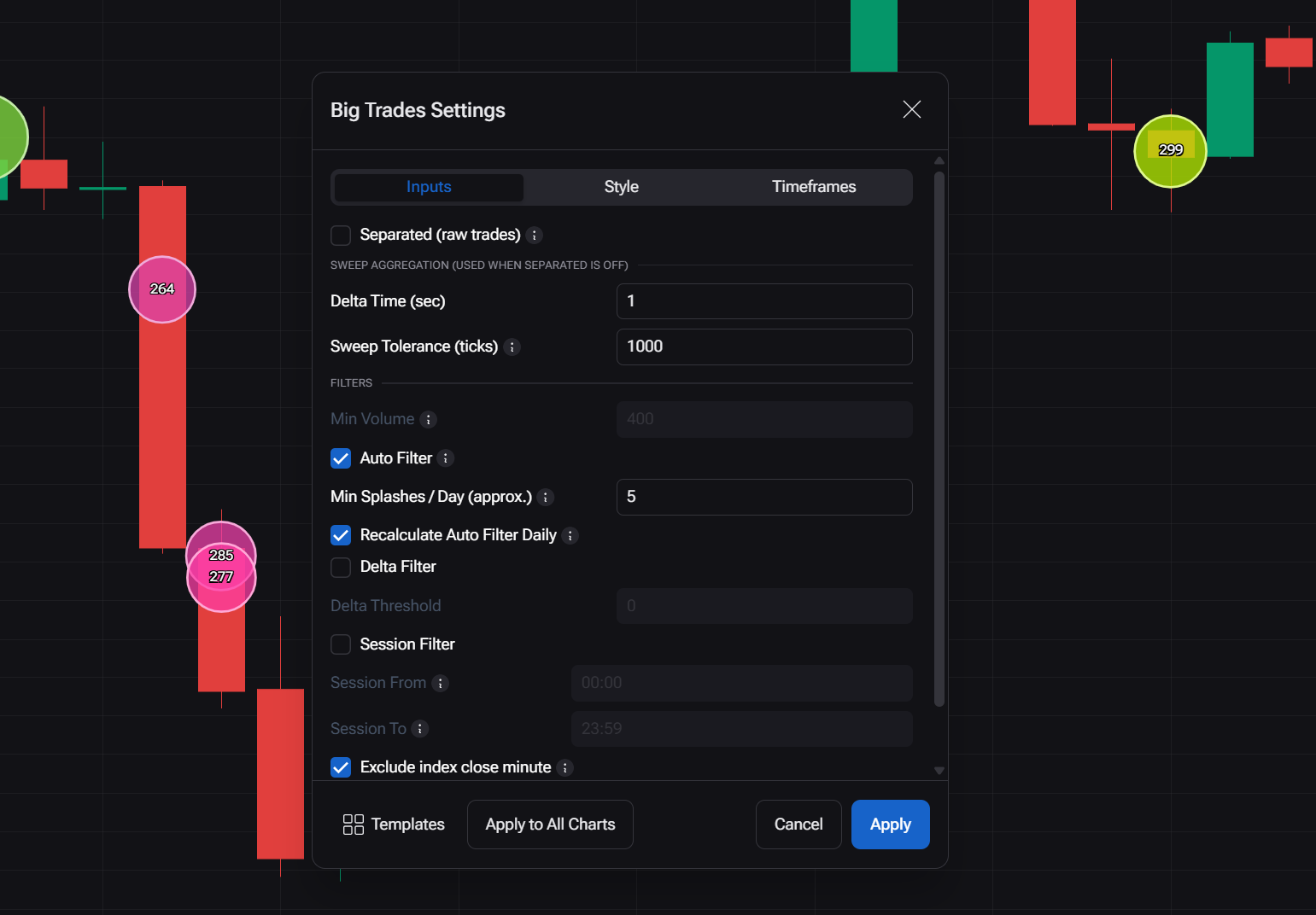
Where to find it: open the Big Trades settings, and Separated (raw trades) is the toggle right at the top. Turn it on and every print stands alone. Leave it off — the default — and the bundling logic runs, controlled by the two dials grouped just below it under “Sweep aggregation”: Delta Time and Sweep Tolerance.
The One Setting That Changes What You’re Actually Looking At: Sweep Tolerance
If there’s one setting worth understanding before you trade off this indicator at all, it’s Sweep Tolerance — the maximum price range a single bundle is allowed to span.
Set it to zero, and you get something specific: absorption. Volume piling into a single price level without price actually moving through it. That’s a very different market event from a sweep — size that moves through multiple price levels in one aggressive push. Absorption at a level tends to mean something is standing there and eating supply or demand. A wide sweep tends to mean something is pushing through a level with force. Conflating the two because “the bubble is big” is, I think, one of the easier ways to misuse this tool.
Where to find it, and a default worth knowing about: Sweep Tolerance lives in the same “Sweep aggregation” section as Delta Time, right under the Separated toggle. The default value is 1000 — effectively the top of its own range (0–1000) — which means out of the box, the indicator isn’t restricting bundle width much at all. If you want to actually see absorption specifically, that’s not something you’ll stumble into by accident; you need to deliberately pull Sweep Tolerance down toward 0. Left at default, most of what you’re seeing leans toward the sweep side of the spectrum, whether you intended that or not.
Reading the Bubble Itself
Size, color, and shape are each carrying separate information, and it’s worth knowing which is which:
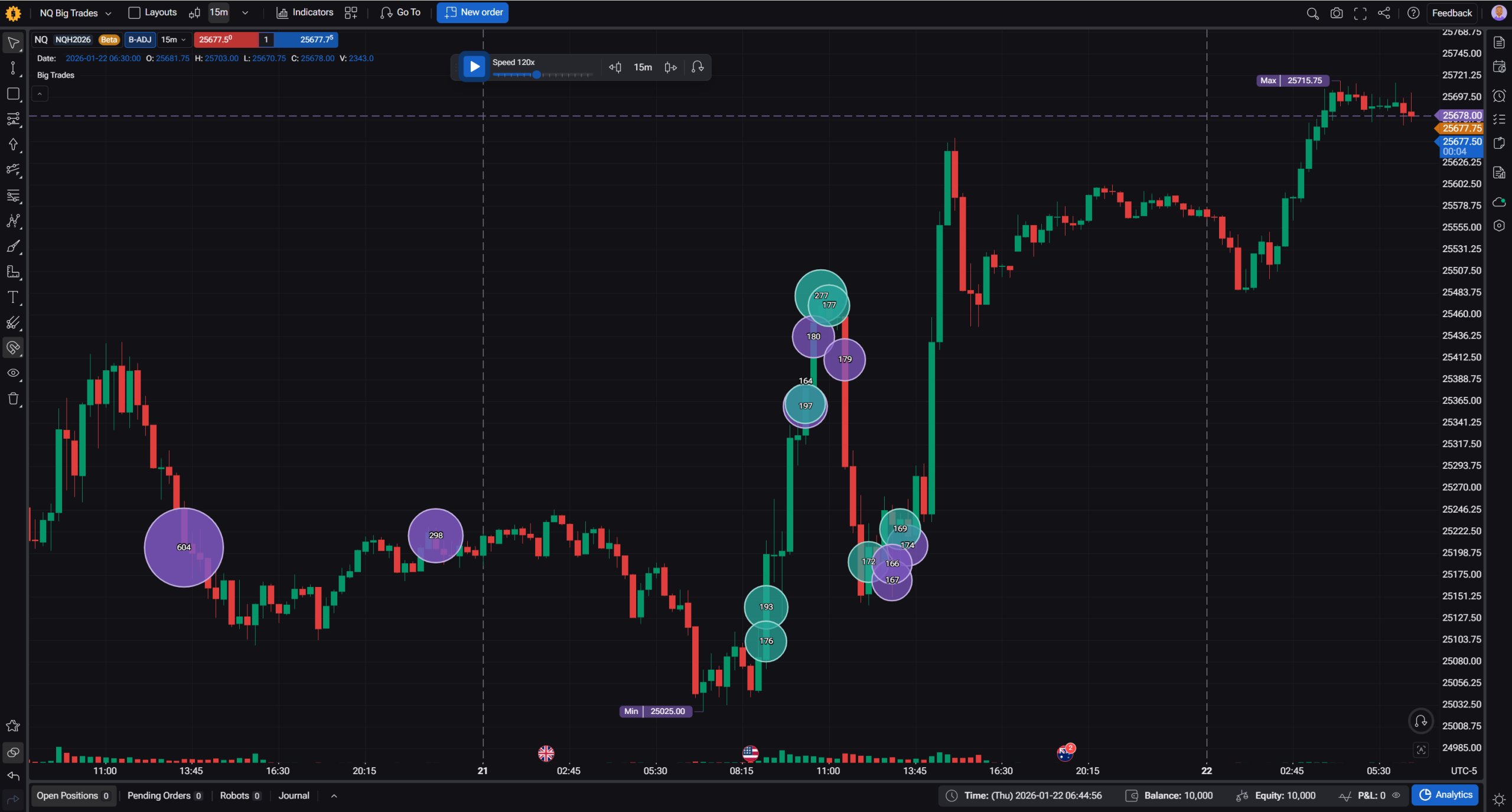
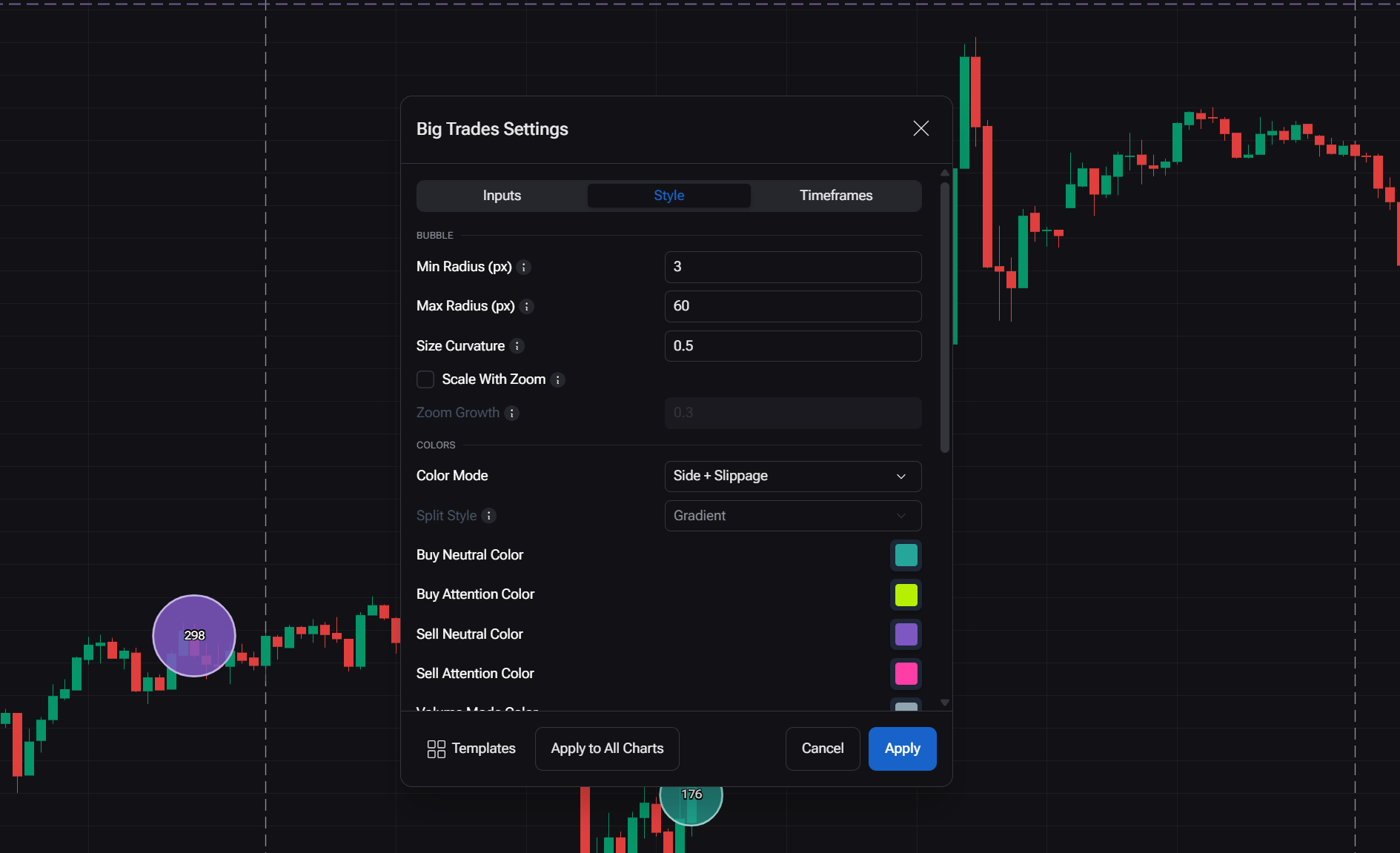
- Size scales with volume, but not linearly. The settings let you control whether mid-sized trades get visually distinguished from the truly enormous ones, or whether only the very largest prints stand out. Worth adjusting rather than trusting the default blindly, especially since the “biggest bubble” is always relative to whatever’s currently in view. Found under the “Bubble” section, that’s also where Min Radius and Max Radius live if the bubbles look too small or too dominant on your screen.
- Color by default encodes side (buy/sell) and slippage: a bubble gets visually “louder” the more the price moved while that order filled. You can switch the color mode entirely to show raw volume, the buy/sell split as a proportion, or net delta instead. That switch, and the actual colors used for each side, live under “Colors.”
- Shape matters more than it looks like it should, and to be clear, there’s no square anywhere in this. Only two shapes exist: circle and rectangle. There are three shape modes to choose from: two “circle-only” modes that never switch shape (one lets bubbles drift slightly for readability, the other keeps them fixed and just labels them), and Adaptive, the default, which is the one that actually changes shape based on what happened in the trade. Under Adaptive, a circle stays a circle for a normal, contained fill. It turns into a rectangle, stretched across the price range the sweep actually covered, once slippage on that bundle crosses a percentile threshold you set (90th by default, meaning only the top 10% widest sweeps get flagged this way). The rectangle is the tool telling you, visually, that this one pushed through a wide range, not just a wide volume, no square involved, just the shape stretching to match how far price actually moved during the fill. There’s also a small amount of hysteresis built in specifically so a bubble sitting right at that threshold doesn’t flicker between circle and rectangle as you scroll the chart. Shape behavior, and how sensitive that circle-to-rectangle switch is, is set under “Shape & Labels,” the same place volume and slippage text labels get turned on or off.
The Auto Filter, and Why It’s Not Just “Big Number = Bubble”
Left on Auto Filter (the default), the indicator isn’t using a fixed volume threshold. It’s recalibrating per instrument, aiming to keep roughly the same density of bubbles per session regardless of whether you’re looking at a quiet Tuesday or an NFP day. It does this by looking back at the last three fully completed sessions, not the one you’re currently watching, so the threshold doesn’t drift mid-session while you’re staring at it.
Practically: what counts as a “big trade” on NQ during a slow August afternoon and what counts as one during a CPI print are two different numbers, and the indicator is adjusting for that automatically rather than making you recalibrate by hand every time volatility shifts.
One NQ-specific detail worth knowing if you trade index futures: the indicator automatically strips out the 15:59 New York minute by default. That’s the moment right before the cash equity close where imbalance-related order flow floods in, real, but not the kind of institutional directional signal you’re actually looking for, and it would otherwise spam the chart with prints that don’t mean what they look like they mean.
Where to find it: Auto Filter, along with the manual Min Volume field it replaces when it’s on, sits under the “Filters” section. Right next to it is Target Splashes, roughly how many bubbles per session you want the auto threshold to aim for. Turn Auto Filter off if you want a fixed, hand-set volume floor instead of the adaptive one; the 15:59 NY exclusion for index futures is a separate checkbox in the same section and works independently of whichever filter mode you’re using.
Why I Trust the Way This Is Built in Forex Tester Online
I said at the start I don’t usually write about how a feature is built, but a few details here are worth calling out specifically, because they’re the kind of thing that separates a real order flow tool from a “big volume = big dot” gimmick.
The aggressor side comes from actual CME data, not a guess. On the futures data source, Big Trades pulls real separate bid-side and ask-side volume off the tape. It’s not inferring direction from whether the last tick ticked up or down; that tick-rule fallback only kicks in on non-futures sources that don’t have real trade-side data to begin with. For NQ specifically, that’s the difference between a genuinely useful side read and a coin flip dressed up as one.
Rollover doesn’t break the picture. Futures contracts roll, and back-adjusted price history shifts historical prices to keep the chart smooth. Big Trades applies that same adjustment to where bubbles get drawn, so a big trade from three contracts ago still lines up with the back-adjusted candle it actually happened on, instead of sitting at the wrong price because nobody accounted for the roll.
The Auto Filter doesn’t drift while you’re watching it. It recalibrates from the last three completed sessions, not the one currently in progress, so the threshold for “big” doesn’t quietly shift under you in the middle of a live session just because volume is picking up right now.
Small details that don’t sound like much, but matter once you’re actually staring at a chart: bubbles are layered so smaller ones draw on top of larger ones, deliberately, so a genuinely huge print doesn’t visually swallow the smaller trades sitting inside it. The circle-to-rectangle shape switch has hysteresis built in, so it doesn’t flicker back and forth as you scroll past the threshold. And the index-close-minute exclusion is scoped specifically to index futures (ES, NQ, YM and their micros) rather than applied everywhere as a blunt instrument.
None of that is the kind of thing you’d notice from a feature list. You notice it from not noticing anything wrong while you’re actually reading the chart, which, with an order flow tool, is the whole point.
What I’ve Actually Noticed So Far on NQ
I want to be upfront: none of what follows is backtested yet. These are observations from screen time, not a validated edge, that’s exactly what the upcoming project work is for. But they’re specific enough that I want to write them down now, before I start testing, so I can check later whether I was actually seeing something real or just pattern-matching on a small sample.
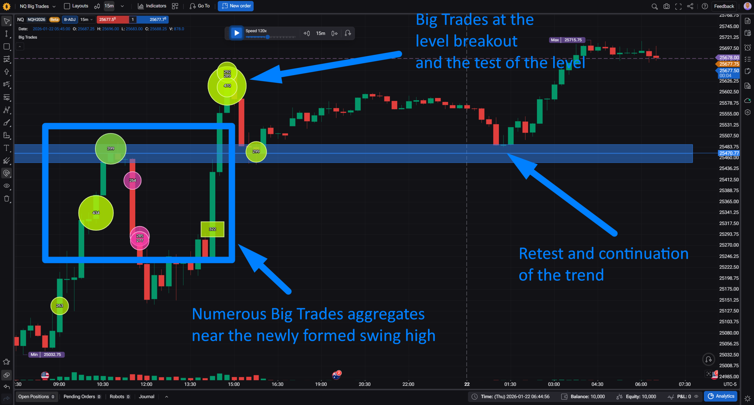
Frequency and location matter more than any single bubble. A single big trade on its own doesn’t tell me much. What’s caught my attention is the pattern over recent bars: how many big trades have printed lately, where, and what price actually did after each one. A big trade in isolation is just one data point. A cluster of them building at the same area, or repeating at a level that already got tested, reads differently.
Big trades reappearing exactly at a level break tend to favor continuation, not reversal. When a level that’s already been tested finally breaks, and a big trade shows up right at that break, my read so far is that this leans toward the same participants continuing to push price rather than the break being a trap. It’s the “same players, still active” read: if size showed up to defend a level before and now shows up again to break it, that’s a different story than size showing up out of nowhere.
Buy side vs. sell side hasn’t been as important as I expected. I went in assuming aggressor side would be one of the more useful pieces of information here. So far it’s been murkier than that, behavior seems to vary by instrument in a way I can’t yet explain cleanly, and I’m not confident the side alone is carrying as much signal on NQ as it might on, say, an FX pair or a single-name future. This is one of the things I most want a real backtest to either confirm or kill.
Reversals and fakeouts show up too, but the tell is more specific than “big trade at the top.” The pattern I’ve noticed isn’t just size clustering at a swing high or low. It’s more precise than that: sharp, point-specific volume right at the peak of a move, combined with an absence of big trades in the approach to the level. A breakout that happens without any big-trade footprint building into it is one I’ve started treating with more suspicion, it reads more like retail momentum or stop-running than size actually driving the move.
What’s Next
And honestly, if reading all this didn’t leave you with at least two or three “wait, but does that actually hold up” hypotheses of your own, I’d be a little surprised. I’ve already got mine. I’m going to go test them right now instead of finishing this coffee, so if you need me, I’ll be in Forex Tester Online arguing with a chart.
Forex Tester Online
Backtest Futures using free CME data and volume analysis tools like Big Trades, Footprint and CVD